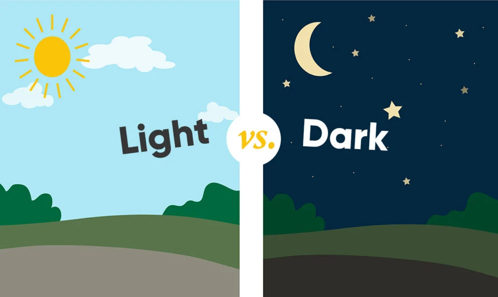
Dark mode websites have become a popular trend among web developers and designers.
They use a dark color scheme instead of the traditional light background, making the website more visually appealing and easier on the eyes. But the question is, do users prefer light or dark mode browsing?
In this article, we’ll explore the benefits and drawbacks of both options and the reasons why some users may prefer one over the other.

The traditional light mode design has been the go-to for websites and digital platforms for a long time. However, in recent years, dark mode websites have become increasingly popular, providing an alternative design option.
What is Dark Mode?
Dark mode is a color scheme that uses a dark background instead of the traditional light one. The text and other elements on the website are in contrasting light colors, making it easier to read in low light conditions.
Benefits of Dark Mode Browsing

According to a study conducted by Tara Sethi and Mounia Ziat, viewing content on a dark background can reduce video glare and eye fatigue. However, there is contrasting evidence that suggests for reading large amounts of text, black text on a white background is easier on the eyes.
Let’s take a closer look at some of the benefits of the dark mode interface.
Reduces Eye Strain
One of the primary benefits of using dark mode is that it reduces eye strain. People who use digital devices for extended periods are at risk of developing digital eye strain, which is caused by blue light. Blue light suppresses melatonin production, making it difficult for users to fall asleep. Dark mode filters out blue light and reduces eye strain.
Saves Battery Life
Dark mode also saves battery life, especially on devices with OLED or AMOLED screens. When a dark mode website is displayed on these screens, the pixels that display black turn off, consuming less power and saving battery life.
Improves Accessibility
Dark mode can improve website accessibility for people with visual impairments. People with low vision or sensitivity to bright light can benefit from a dark color scheme as it reduces glare and improves legibility.
Enhances Visual Appeal
Dark mode can also enhance the visual appeal of a website. The contrasting light colors against the dark background create a unique and stylish design that attracts users.
Drawbacks of Dark Mode Browsing
Limited Visibility in Bright Environments
One of the primary drawbacks of dark mode is that it is difficult to read in bright environments. The dark background reduces visibility in bright light, making it challenging to read the text.
Difficulty in Reading Certain Colors
Certain colors can be difficult to read on a dark background, making it essential to choose the right colors while designing the website. For example, yellow text on a dark background can be challenging to read.
Inconsistent Design
Dark mode may not work well with all website designs, and implementing it can be challenging. Inconsistent design can make the website look unprofessional and unattractive.
Light Mode vs. Dark Mode – User Preference
The debate on whether light mode or dark mode is better is ongoing. While both options have their advantages and disadvantages, user preference is subjective.
Some users prefer dark mode for its visual appeal, while others find it challenging to read in bright environments. Similarly, some users prefer light mode for its readability, while others find it too bright and uncomfortable.
How to Implement Dark Mode on a Website
Implementing dark mode on a website can be a challenging task, but there are a few things you can do to make the process easier. Here are some tips on how to implement dark mode on a website:
- Use CSS media queries: Use CSS media queries to detect the user’s preference and switch between light and dark mode accordingly.
- Use a toggle switch: Allow users to switch between light and dark mode by using a toggle switch on the website.
- Test the design: Test the design in both light and dark modes to ensure that it looks good and functions well in both color schemes.
- Choose the right colors: Choose colors that work well in both light and dark modes, ensuring that the website remains visually appealing and easy to read.
- Use a WordPress theme with a built-in dark/light mode switch
WordPress Themes with Dark / Light mode variations
Here we’ll add some of the best WordPress themes with a Dark mode switch option.
Bottom Line
The debate on whether users prefer light or dark mode browsing is ongoing, with both options having their advantages and disadvantages. While dark mode reduces eye strain, saves battery life, and improves accessibility, it can also be challenging to read in bright environments and may not work well with all website designs.
On the other hand, light mode is more readable but can cause eye strain and may be too bright for some users. Implementing dark mode on a website can be challenging, but with the right design elements and testing, it can provide users with a unique and stylish browsing experience.
FAQs
Is dark mode better for your eyes?
Dark mode reduces eye strain by reducing blue light, which can disrupt sleep patterns. However, it can also be challenging to read in bright environments.
Does dark mode save battery life?
Yes, dark mode can save battery life on devices with OLED or AMOLED screens as the pixels that display black turn off, consuming less power.
Can dark mode improve website accessibility?
Dark mode can improve website accessibility for people with visual impairments, as it reduces glare and improves legibility.
How can I implement dark mode on my website?
You can implement dark mode on your website by using CSS media queries, adding a toggle switch, testing the design, and choosing the right colors. Or use a WordPress theme with dark mode support.
Which is better – light mode or dark mode?
The preference for light or dark mode is subjective, with both options having their advantages and disadvantages. Users can choose the color scheme that works best for them.
Disclosure: Some of the links on the page may contain a ref code (affiliate links), that tells the other side that we have sent you. If you liked what we suggest and you make a purchase, we may receive a commission.


Leave a Reply