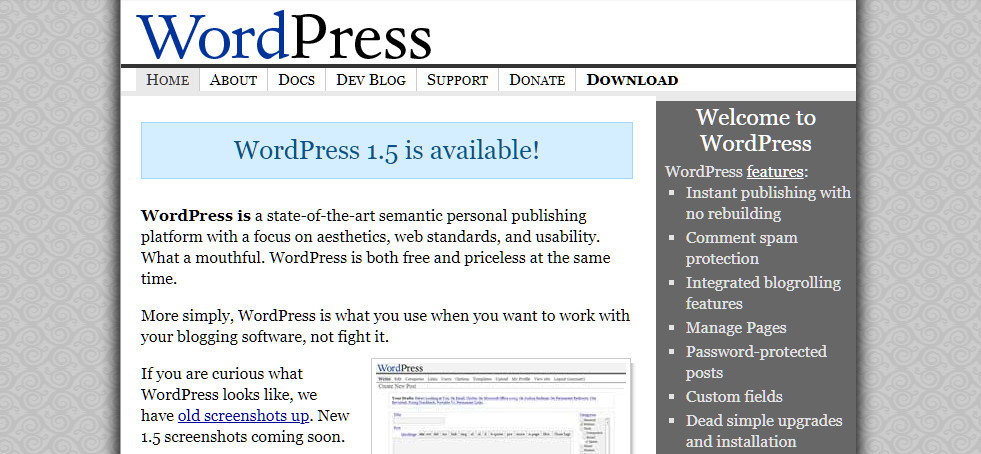
In this post, we’ll travel in time just to take a look (and have a laugh) at how design trends have changed, and in particular how WordPress websites used to look before.
That’s not just your average blogs, we will look into some of the biggest names that knew even back then how awesome WordPress was!
Thanks to the Wayback Machine we can take a look back, to times when there were more creativity and fewer web guidelines and standards.
Let’s start.

Popular sites that use WordPress and how they looked in the past
It’s good to go back in time and recall how different things were, and how web design is changing so fast that even the big players can’t adjust.
Now internet is driven by profits, even small bloggers know what is Search engine optimization and chase the big payday from day one.
1. The Star Wars Official News Blog
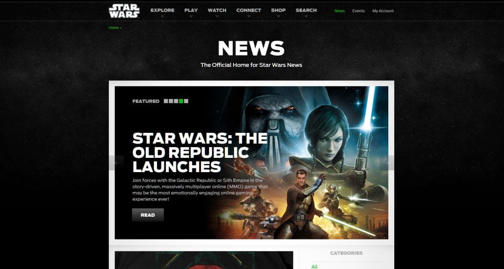
A long time ago in a galaxy far, far away….there was one WordPress blog that looked ahead of its time.
The Star Wars official blog launched in 1999 (yes that’s 20+ years ago) is redesigned and completely migrated to WordPress in 2011.
The structure of the homepage is so classic for WordPress at that time. With a boxed layout, slider on top and 2/3 to 1/3, latest posts, and right sidebar.
and now…
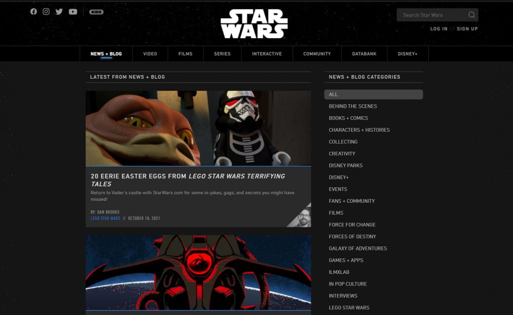
In 2021 the website still runs on WordPress and we can say it hasn’t changed much like some of the other examples in this article.
2. TechCrunch
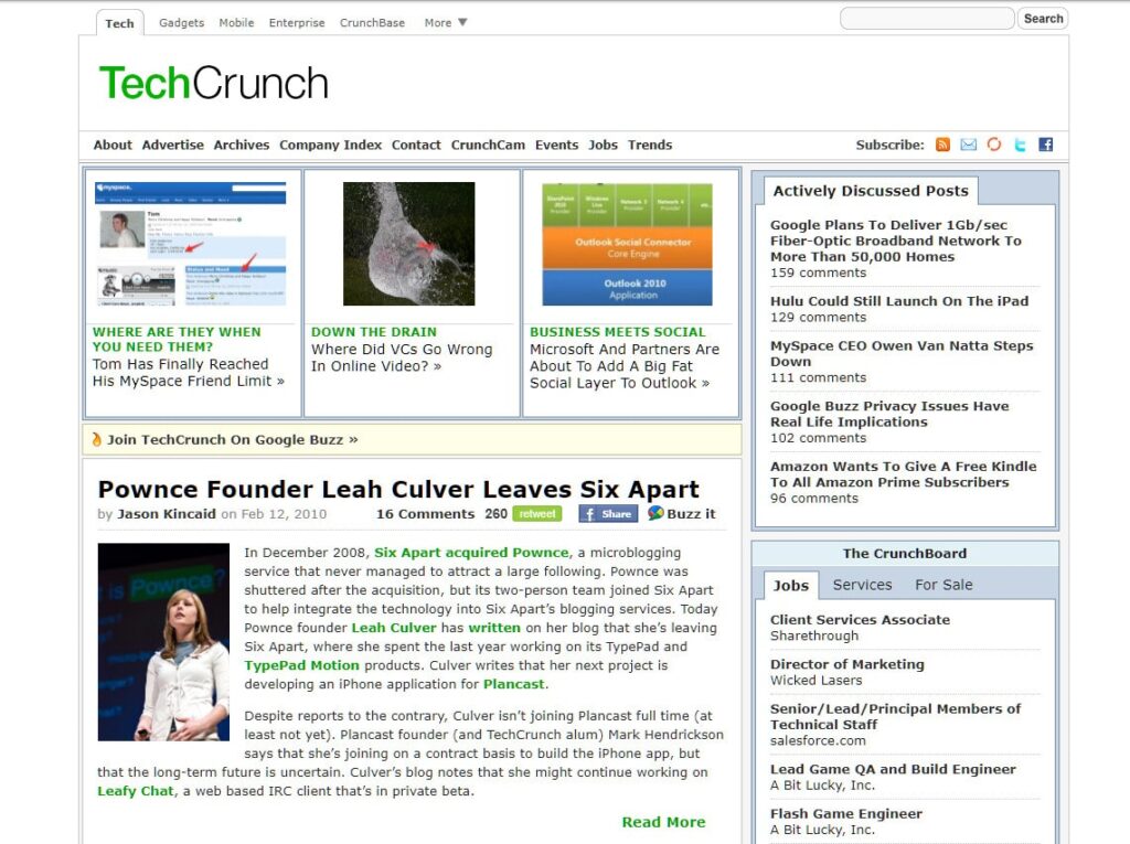
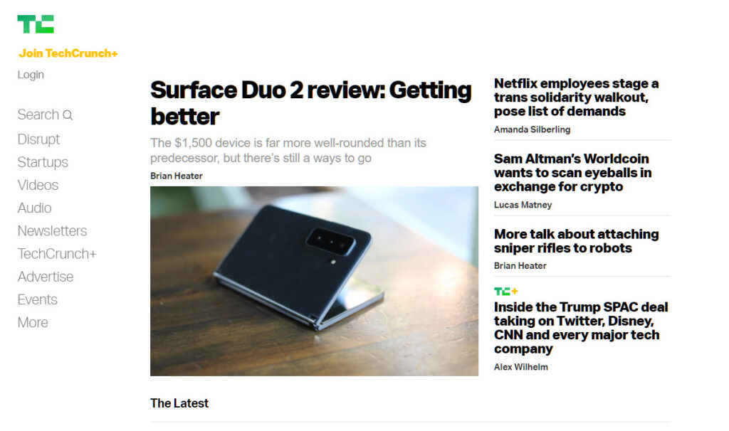
TechCrunch is a large technology news provider. It first appears online in 2005, but the image above is from 2010 when the site switched to WordPress.
And now…
3. The Mozzila Blog
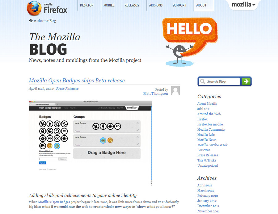
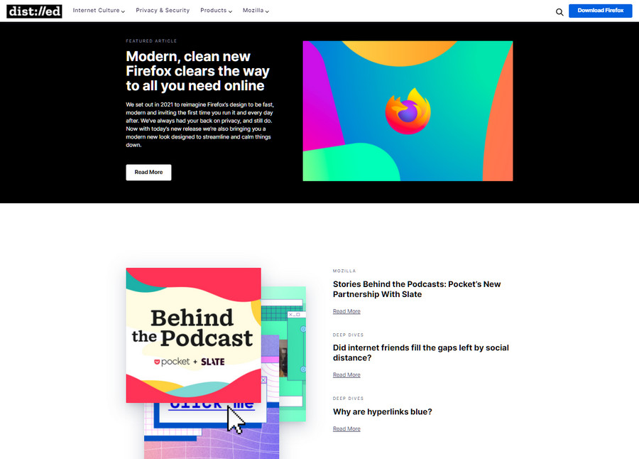
The people’s favorite browser – Firefox (sorry Chrome), and all the news around the project were diligently collected in this WordPress blog.
The classic “Archives” widget is there, with the even more classic “Categories” list. Just beautiful!
And now…
4. TED Blog

What’s the opposite of a TED talk?
TED Blog.
Very minimal and information-rich blog with a sidebar full of tags, no really…
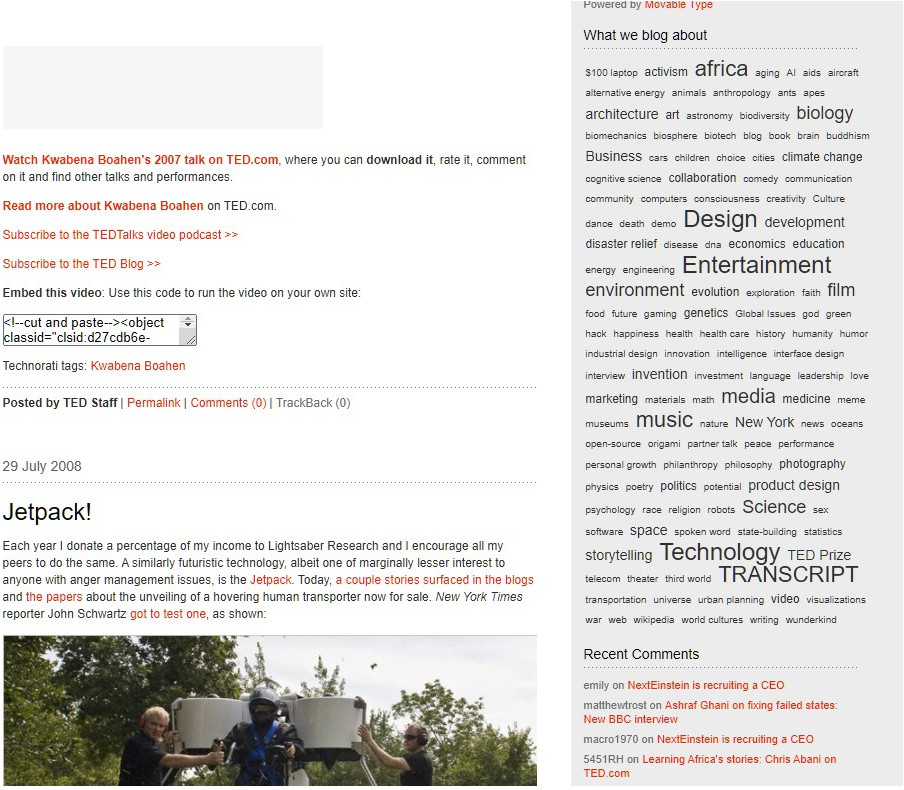
We can say – The TED tags.
This used to be a popular way to display topics back in the day. Now it’s not used anymore.
And now…

5. Usain Bolt Official Website

Should the fastest man in the world have the fastest-loading website in the world also?
That’s not happening, for now, not only that but usainbolt.com doesn’t even have an installed SSL certificate, and the website loads only in HTTP.
Usain if you are reading this, you need a new webmaster. Hit me up, info is in the contacts section.
And now…

Pretty much the same, but if you are that Bolt, the last thing you will care about is your website’s secured connection.
Most of these websites had to change their design completely, somewhere around 2010. As most of the websites were built with Flash, were not responsive on mobile devices, or even had no content management system at all.
Have Internet Websites Become Boring nowadays?
This question arises looking at what surrounds us today on the internet.
Everyone is striving to write the perfect piece of content. 2000+ words long articles have become the standard for any topic today.
Has everything become profit, optimization, results-driven, clickbait, marketing, and Google pleasing?
Or maybe the biggest sits were always a few moves ahead of the pack.
It’s always funny and also kind of nostalgic to go back in time to see how things were before, with photos, videos, and even more websites. You can always do that by loading a URL in archive.org
The point of the post was to see how WordPress is a preferred CMS in the past decade and all the big names are using it – then and now.
Disclosure: Some of the links on the page may contain a ref code (affiliate links), that tells the other side that we have sent you. If you liked what we suggest and you make a purchase, we may receive a commission.


Nice read, Daniel. Your post just made me nostalgic and took me 10 years ago back when I was enter the WordPress world.. Time changes everything. Thanks for the post.